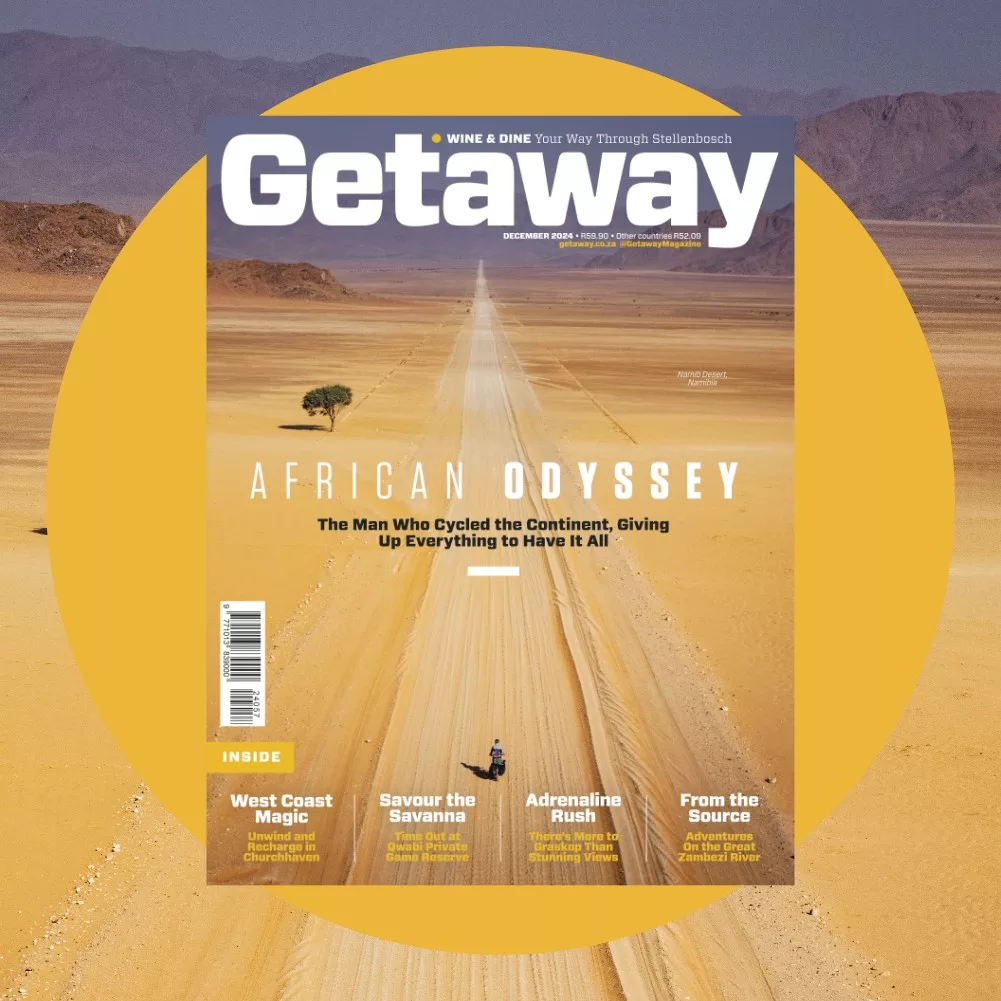
No matter who you are, if you’re an enthusiastic photographer, you’ll have dreamed of shooting a magazine cover. However, there probably isn’t an image that’s more difficult to make.
Magazines are finite and there are only so many cover shots produced each month (or week). Of all the photographs shot around the world, only the tiniest fraction ends up gracing the front of a magazine.
In order to shoot a cover, it is best to understand how editors and art directors choose the photos.
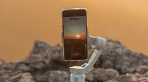
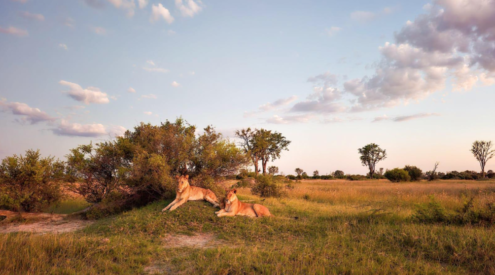
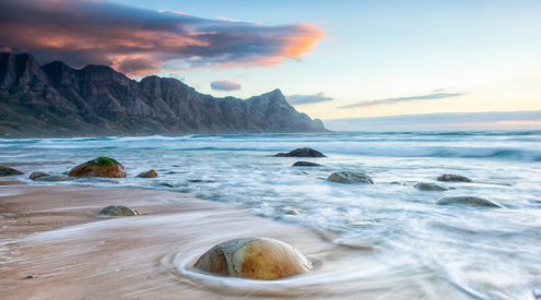
It goes without saying that all the aspects of the shot have to be exceptional – perfect light, composition and a fantastic subject. What most photographers don’t appreciate, however, is that, for it to be used on a cover, a great shot needs space.
Nearly all magazines require space in which to place their nameplate or masthead – usually across the top of the magazine – as well as space around the main subject for cover lines. As a magazine cover is essentially the best advertisement for the publication, it should entice people to have a look inside. The image has to have stopping power. After that, it’s the job of the words to clinch the sale. If there is no space for words or a masthead, even the greatest of shots will not be used on the cover.
While it is not always necessary to shoot in the portrait orientation, it definitely helps photographers see their cover shots better. More importantly, when faced with a cover shoot, you should bracket your compositions.
Although bracketing is a term usually reserved for lighting, where you shoot slightly different exposures so that you get the perfect shot, the same principle can be applied to covers. Shoot lots of options so the creative team in the magazine design department has something to work with.
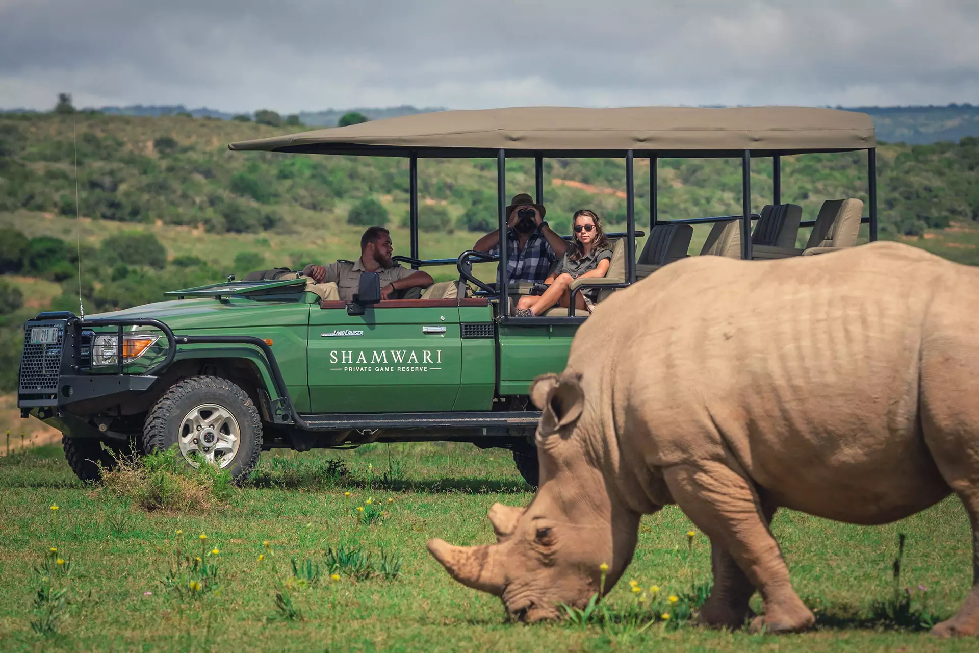
This is particularly important if you are shooting for a travel or wildlife magazine. These are some of the hardest images to get right, as the subject matter is so variable and unpredictable. It is completely different to, for example, a men’s magazine, where you shoot to a recipe.
Once you’ve identified an interesting subject which may work, shoot it as you see it. Then begin to sketch around your shot for other possibilities and angles and, most importantly, take one or two versions of the shot with loads more space (more than you think the design team will need). As a rule, it’s always easier to crop a shot to make a good cover than to create more of the image.
To view the entries in the Getaway Cover Photo competition, go to www.facebook.com/GetawayMagazine. The winning image will grace our July 2011 cover.

